
Case study //002
Wordcast
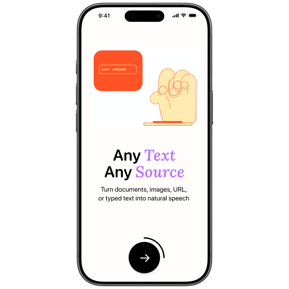
A text-to-speech iOS app that lets you listen to any content - articles, documents, emails - read aloud by an AI-generated voice.
//Role
Lead Designer
//Platform
iOS · Web
//Tools
Figma · Claude Code
//Company
44pixels

//01
Context
From 0$ to $466K MMR
[in under 3 month]
Wordcast started as an internal experiment at 44pixels - exploring a new way of designing and building with Claude code. The idea was simple:
build something small, ship it, and see what was possible. I was handed
this challenge.
When I started the project, a basic structure already existed. My job was to take that foundation and figure out what kind of app Wordcast should feel like.


[Before]
[After]
//02
Direction
I made a deliberate decision to pull in two directions at once: simplicity
and playfulness.
Simplicity because the product's function is genuinely simple - you add content, you listen. The design shouldn't fight that. Every screen needed to get out of the way and let the content breathe.


Playfulness because simplicity alone isn't enough to be memorable. I wanted Wordcast to feel like a product people enjoy using, not just a utility they tolerate. That meant building a layer of character into the experience - through illustration, animation, and moments of delight throughout the app.

//
Rather than a list of names and accents, each voice became a character - a person with a face, a feel

//03
The Built
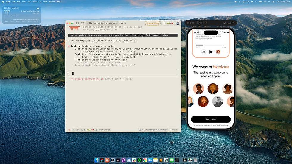
Wordcast was built during a moment when AI-assisted development was just starting to become a real option for small teams. Adam, our CEO, decided to try building the app himself using Claude Code - and given how simple the core concept was, it was actually feasible.
For a while, the two of us worked in parallel - I designed, he built. But we kept running into the same problem: small details getting lost in translation.
A spacing decision, an animation behaviour, a transition that didn't feel quite right. Every back-and-forth took time and pulled Adam away from the more fundamental parts of the build.
//
So we changed the approach: I got access to the code directly
Instead of handing off specs and waiting, I could go in directly and make the design behave exactly the way it should. Adam could focus on the architecture and his other work. It meant fewer cycles, less friction, and a final product that was much closer to the intended design.
//04
Onboarding Experiment
After launch, we felt we were leaving conversion on the table. I looked at
how other apps handled onboarding and noticed a pattern - the ones converting best made the user feel like the app was built for them before
the paywall appeared.
The new onboarding opens by asking for your name - then uses it throughout every subsequent screen. By the time you reach the paywall, you've already invested in the experience.
A/B Test
Tested against the original onboarding- Personal version won
5%
Drop in paywall views
15%
Increase in conversion

Onboarding //01
01 →
02 →
03 ·


Onboarding //02
//05
Outcome & Reflection
Wordcast launched on the App Store and found real users quickly. The A/B test on the personalised onboarding validated the approach - more users reached the paywall and more started the trial.
The funnel at the top was performing well - 91% of users who installed
the app reached the paywall, and our best-performing onboarding variant
had a 55% trial start rate. But something was breaking down right after the trial began. 68% of all cancellations happened on day 0 - the same day
the trial started.
Looking at the behaviour data, the pattern became clear: users weren't rejecting Wordcast. They were managing risk. Most of them had tried to use the app before cancelling - 76% uploaded at least one piece of content - but almost all of it was short and trivial. They were testing the app, not actually experiencing it. They never heard what Wordcast was really capable of, and so they cancelled before they could.
91%
Paywall View
55%
Trial start
76%
Uploaded content
68%
Cancel on day 0
The highest-leverage idea was a voice-first onboarding: rather than explaining the app, make the onboarding be the app. The user selects their narrator and immediately hears them read a real piece of curated content - something long enough to actually settle into. The paywall then appears as "continue listening" rather than "pay to use this." A small but significant framing shift.
Alongside that, a simple "remind me before my trial ends" opt-in - not a marketing prompt, but a genuine service. If users know they won't be charged unexpectedly, the defensive day-0 cancel becomes unnecessary. And longer term, a curated editorial content feed to give users a reason to open the app regularly, independent of their own reading list.
//
What stayed with me was the shift in how I was thinking - less about screens, more about behaviour and what it takes for a product to earn someone's trust