
Case study //001
Cue
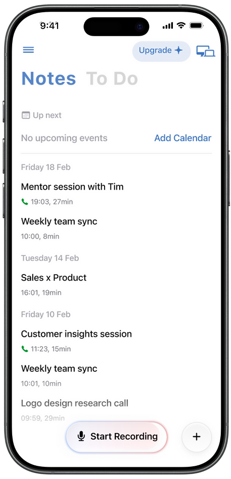
An AI meeting recorder and note-taking app - records your meetings, transcribes them, and generates a structured summary so you never have to take notes again.
//Role
Lead designer
//Platform
iOS · web · Desktop
//Team
PM · 3 Engineers · 2 Visual Designers · Motion Designer · Marketing
//Company
44pixels
Context
I joined 44pixels as an intern around the time Cue was being built - right before AI tools started flooding the productivity space. It was early enough that the market wasn't crowded yet, and the product had real room to grow.
Over the following year and a half, Cue became the company's main product, and my role grew with it - from intern touching various projects, to lead designer owning the full product experience across every platform.

[Chapter One]
//01
The Paywall
Before I became lead designer on Cue, I was asked to look into referral and sharing flows. At the time, the team had been testing different ways to convert free users - limiting recording time, capping the number of recordings, requiring payment before recording at all.
It led me to think about how else we could approach this. The summaries that Cue generates reminded me of reading an article on a news website.
//
You land on an article, read the first few lines, get pulled in - and then the paywall appears.

I decided to test the same mechanic in Cue. Remove the recording limit entirely for first-time users - let them record a full, real meeting. Then, as they began scrolling through the first few lines of their own summary, a gradient overlay would appear asking them to start a free trial to read the rest.
The content was already theirs. It was their actual meeting, their words, their action items - just out of reach. The paywall didn't block the app anymore. It gave users a reason to unlock it.

A/B Test
Tested against original paywall - new flow won
From
5.3%
Trial conversion
To
29.6%
Trial conversion
[Chapter Two]
//02
Becoming Lead Designer
After the paywall experiment, I continued working on Cue - taking on
more and more of the product - and eventually became the lead designer
on the app.
By this point Cue had grown significantly. The product had moved beyond its original iOS-only form and was expanding to web and desktop. The focus shifted from finding product-market fit to scaling - growth, retention, and building a product that could compete in an increasingly crowded market.
With that came a bigger team and a different way of working. I was now collaborating daily with a product manager, two iOS engineers, a desktop and web engineer, two visual designers, and a motion designer. Design decisions had more stakeholders, more constraints, and more moving parts. Learning to work within that - to move fast without losing craft - was one of the most valuable parts of this chapter.
My role covered the full product: new features, cross-platform consistency, growth experiments, and thinking ahead about where the product needed
to go next.

[Chapter Three]
//03
The Desktop recorder
A macOS menubar app that lets users record meetings directly from their computer - no bots, no setup every time. One click to start recording, one click to stop.
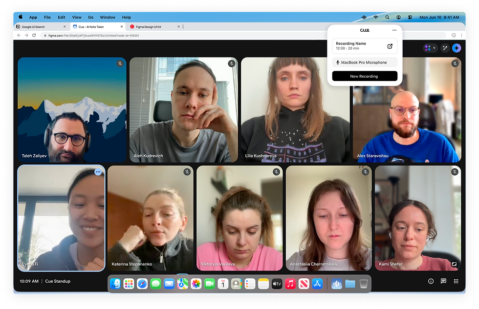
It was built in two weeks. That constraint shaped everything - every decision needed to be right, buildable, and shippable fast. I worked closely with the engineer, motion designer, and visual designer from day one, to make sure what I was designing was actually possible to build in that timeline.
The design challenge was also unique. A menubar app lives in a completely different context to a mobile or web app - it's a small, floating widget that needs to be immediately understandable and completely out of the way when not in use. There's no space for complexity. One click to start recording, one click to stop. That's it.


But getting users to that first click required its own careful thinking. The desktop app needed to be downloaded, installed, and given the right system permissions before it could work - that's a lot of friction for a new user. I designed the entire setup flow as a Desktop-based onboarding experience that walked users through each step clearly, handled the permission states gracefully, and got them to "you are all set" as smoothly as possible.
//04
Speakers
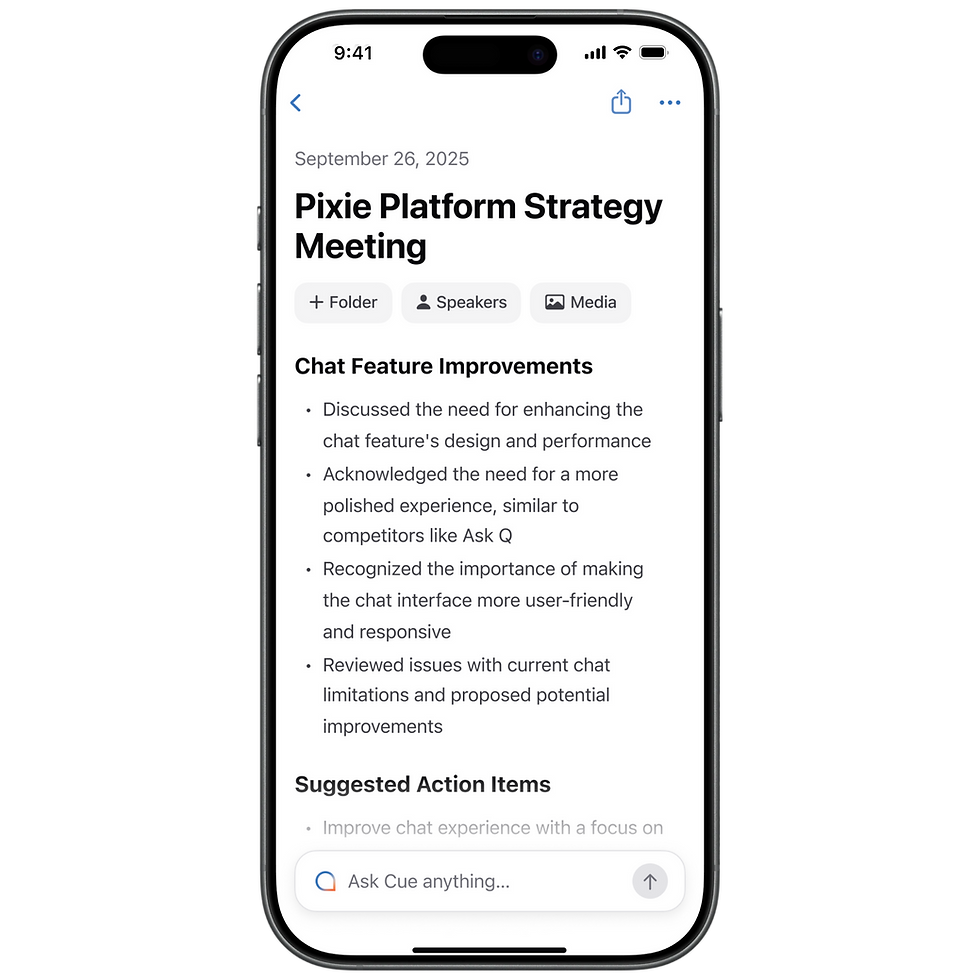
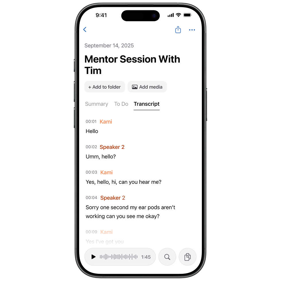
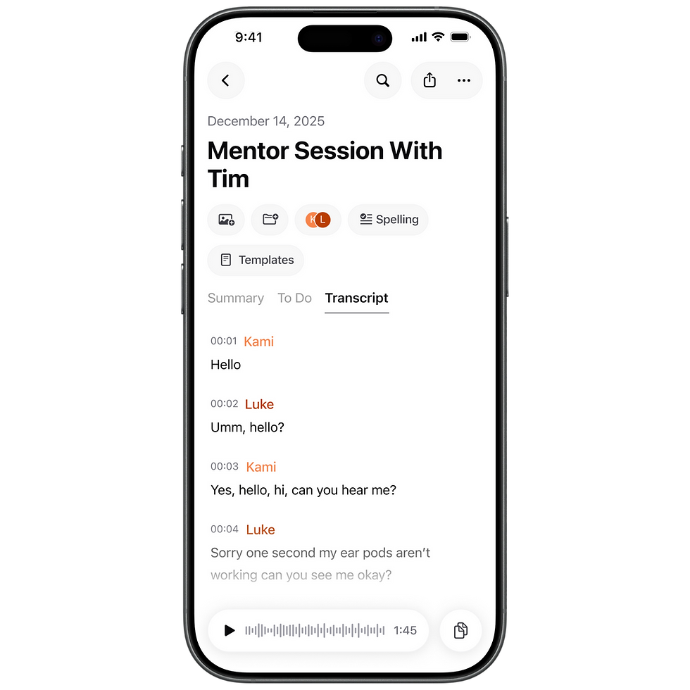
When Cue first launched, the transcript was hidden behind the summary - a secondary menu most users never visited. Then we moved it forward, and something interesting happened: people started engaging with it heavily. Reading it, copying from it, exporting it. The transcript wasn't just a backup of the recording - it was useful in its own right.
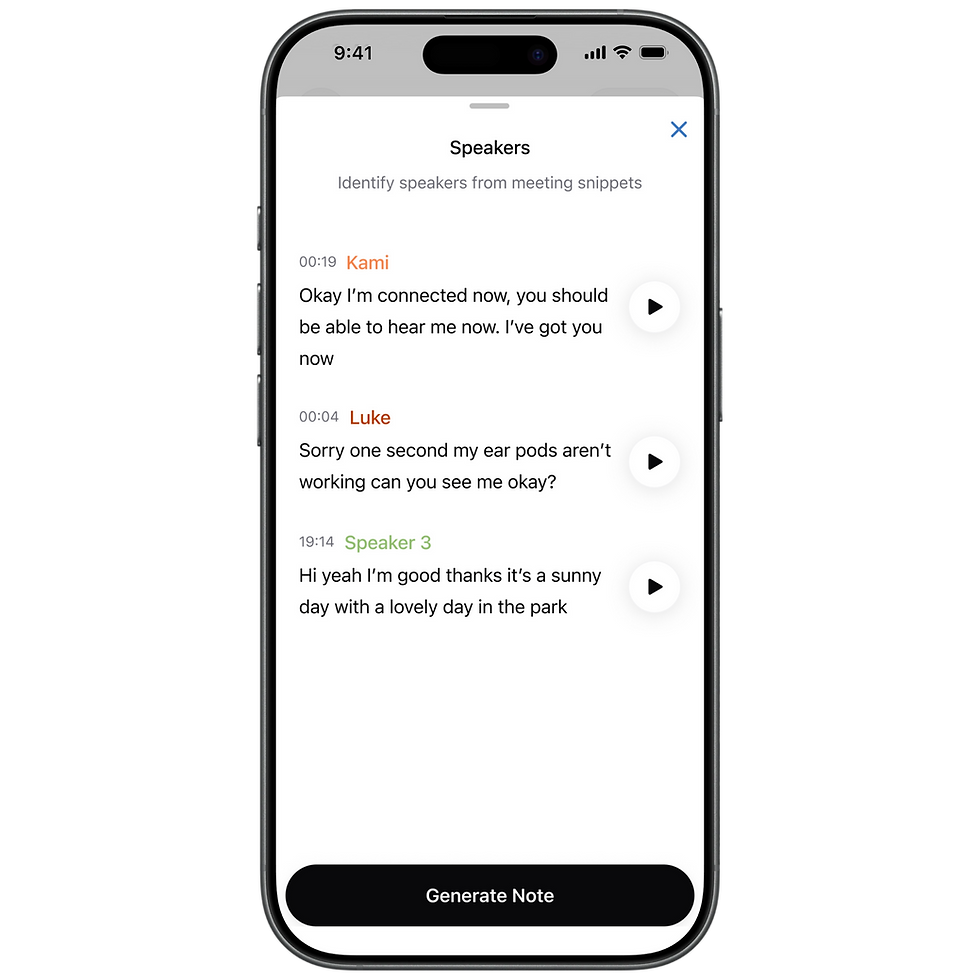
But it was a wall of timestamped text with no indication of who said what. So we added speakers.
//Phase 0ne - Shipped
The first version was intentionally simple. Each speaker was assigned a colour-coded label in the transcript. Tap a label, type a name, and it updates everywhere in real time. A palette of 10 colours meant even large group meetings could be distinguished clearly. It was a small change that made the transcript dramatically more readable and useful.


//Phase Two - Designed
The second version was about elevation. Speakers moved from being a transcript-only feature to living on the main note page - visible as stacked avatar initials in the note header. A new identification flow let users confirm who was who by listening to short audio snippets of each speaker's voice, rather than guessing from context. The transcript labels became real names. The whole feature felt less like a settings task and more like a core part of the meeting record.
//Phase Three - Next Steps
The bigger picture Speakers was never just a UX improvement. It was the first step toward something larger - using the people in a meeting as a growth mechanic. Identified speakers mean saved contacts, calendar connections, shared notes, and collaboration features. V1 was the foundation. V2 was the next floor. What came after would have been the building.
//05
Future designs
As Cue matured, my role shifted increasingly toward thinking about where the product needed to go next - not just executing on current features, but designing the next version of the product before it was scoped or scheduled.
The future designs I worked on covered both iOS and web, and represented a meaningful step forward from what had been built.
The home screen gained a horizontal calendar strip showing the current week, turning the app from a passive archive into something that felt present and proactive. The note page was refined too - speakers moved into the header as stacked avatars, the Share button became more prominent, and the action menu was cleaned up and simplified.


The web app evolved from a functional three-column layout into something that felt more like a proper productivity tool. The note page became wider and more document-like - giving the content more room to breathe. A live recording state appeared in the bottom bar. The To Do panel became a dedicated column. The overall experience felt less like a web wrapper around the mobile app and more like a product that understood how people work at a desk


None of these designs were built. But designing them was part of the job - knowing where you're going before you get there, so that when the team is ready to move, the thinking is already done.
//06
The Website withcue.ai
Alongside the product work, I also built the Cue marketing website - designed and coded it myself using Claude Code.

[Chapter Four]
Reflection
Cue grew from an early-mover in a wide open market into a product competing in one of the most crowded spaces in AI productivity. A year and a half after launch, the meeting assistant market had changed dramatically - more players, more noise, slower growth. After close consideration, the company decided to consolidate its focus and wind down Cue.
Looking back, this was the project that taught me the most - not just about design, but about what it means to work on a product at scale. I learned how to collaborate across a full team without losing the quality of the work. I learned how to balance shipping fast with thinking long-term. I learned how to design for growth, not just for screens.
Success doesn't always look the way you expect it to. Cue reached real people, solved a real problem, and built something genuinely good. The ending came sooner than we hoped - but it doesn't change what we built.
1.01M
Installs
4.6
Avg global rating
2.4M
Summaries