Cue //Case study //02
20% lift in conversion
//Role
Designer
//Platform
iOS · Web
//Team
PM · Engineer
//Company
44pixels
//01
Finding a better way to convert free users
The team had been testing different conversion mechanics - limiting recordings, capping summaries, gating the app upfront. I was asked to look at referral flows, but it led me to a bigger question.
Before I became lead designer on Cue, I was asked to look into referral and sharing flows. At the time, the team had been testing different ways to convert free users - limiting recording time, capping the number of recordings, requiring payment before recording at all. It led me to think about how else we could approach this.
A/B Test
Tested against original paywall - new flow won
From
5.3%
Trial conversion
To
29.6%
Trial conversion
//02
Converting without blocking
Every approach we tried asked users to commit before they'd had a chance to feel what the app could actually do.
Users downloaded the app, recorded a meeting - but didn't convert. Limiting the number of recordings meant users never really got to feel what the app could do. Capping summary length resulted in summaries too short to be useful. Trying to guide them through an explanatory flow before their first recording added friction exactly where we needed them to feel the magic.

//03
A pattern borrowed from a different product
Reading a meeting summary in Cue reminded me of reading an article behind a paywall - and that comparison became the whole idea.
While working in the app, the way you read your meeting summary reminded me of reading an article in a newspaper app. You get the title, maybe a few lines to pull you in - and the moment you're already committed, the paywall appears.
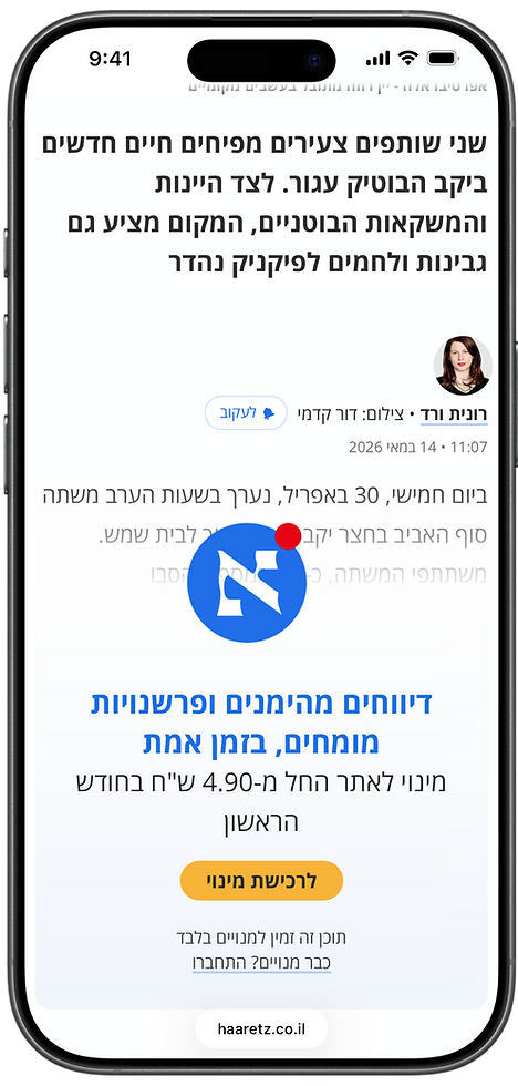

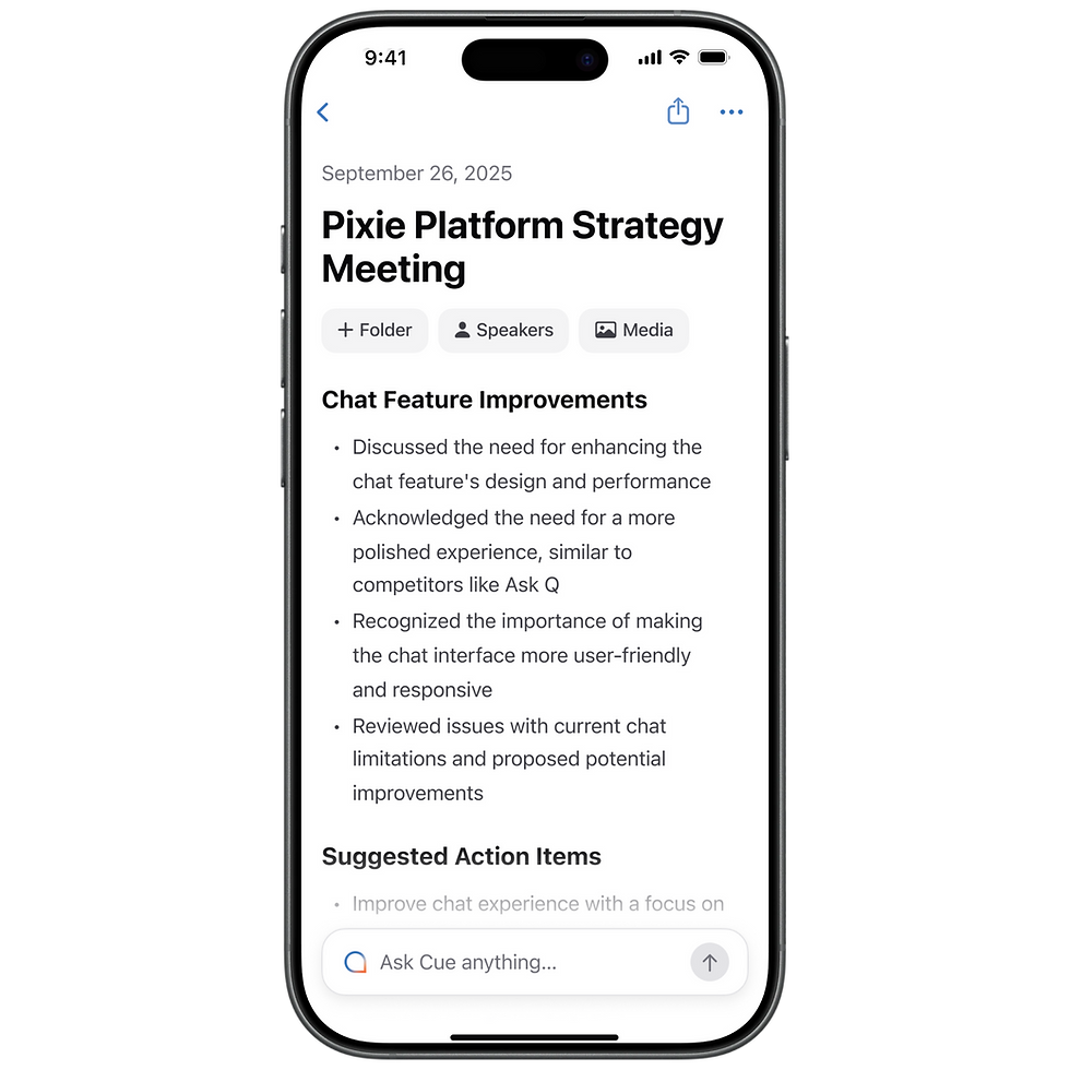
I wanted to create the same effect in Cue. No limitations on the first recording - let the user record a full meeting and feel the app at its fullest. Then, give them a glimpse of their summary and lock it before they can read the whole thing. The content was already theirs. Their meeting, their words, their action items - just out of reach. The goal wasn't to lock people out, but to find the right moment to keep them in long enough to experience what Cue could really do.

//04
The simplest solution can be the most effective one
A 20% lift in free trial conversion from one design insight. No new features, no complex flows - just the right friction, at the right moment.
We ran an A/B test. Conversion to free trial increased by over 20%. One of the main things I took from this experiment: good design isn't necessarily the most complex or ambitious thing you can build.
//
A simple design thinking solution, applied at the right moment, can be just as effective - if not more - when it comes to scaling a product.
