Cue //Case study //001
The Mobile App
//Role
Lead Designer
//Team
PM · 3 Engineers · 2 Visual Designers · Motion Designer · Marketing
//Platform
iOS · Web
//Company
44pixels

//01
The starting point
A single-feature recorder, a growing market, and a role that kept expanding.
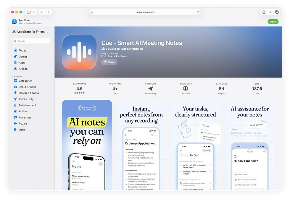
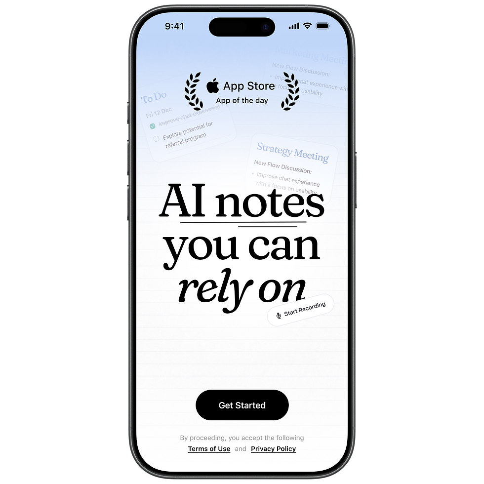
Cue started as a mobile-first app with one core feature - record your meeting, get a summary. Simple, focused, effective. As more users came in, the app grew into a multi-platform product with a widening feature set. The mobile app was always the heart of it.
1.01M
Installs
4.6
Avg global rating
2.4M
Summaries
//02
Adding depth without adding friction
Cue's biggest strength was how simple it felt. The challenge was keeping that as the product grew.
How do you take a simple, one-feature app and grow it into something more personalised and multi-layered - without losing the simplicity that made people love it in the first place?
//03
Simple on the surface, personal underneath
The app needed to feel complete for someone who never touched the settings, and flexible for someone who wanted to make it their own.
Our users were mainly small business owners - people for whom technology, and especially AI, wasn't always a natural fit. That kept us honest. Every new feature had to earn its place without adding friction. As the app grew more complex, the challenge to keep it uncomplicated became greater. We always came back to the same question: does this make Cue feel more powerful, or does it just make it feel harder to use?
The goal was an app that stayed simple for anyone who picked it up, but opened the door to a more personalised experience for those who wanted it.

//04
Speakers and Templates
An example of two features that took Cue from a one-size-fits-all recorder to something that fit the way each person actually worked.
Speakers
When Cue first launched, the transcript lived behind the summary - a secondary tab most users never visited. Then we moved it forward, and something interesting happened: people started engaging with it heavily. Reading it, copying from it, exporting it. The transcript wasn't just a backup of the recording - it was useful on its own.
//Phase 0ne - Shipped
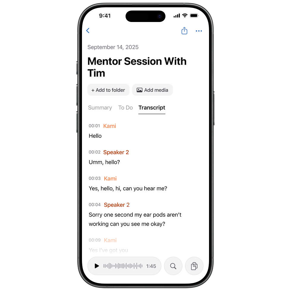
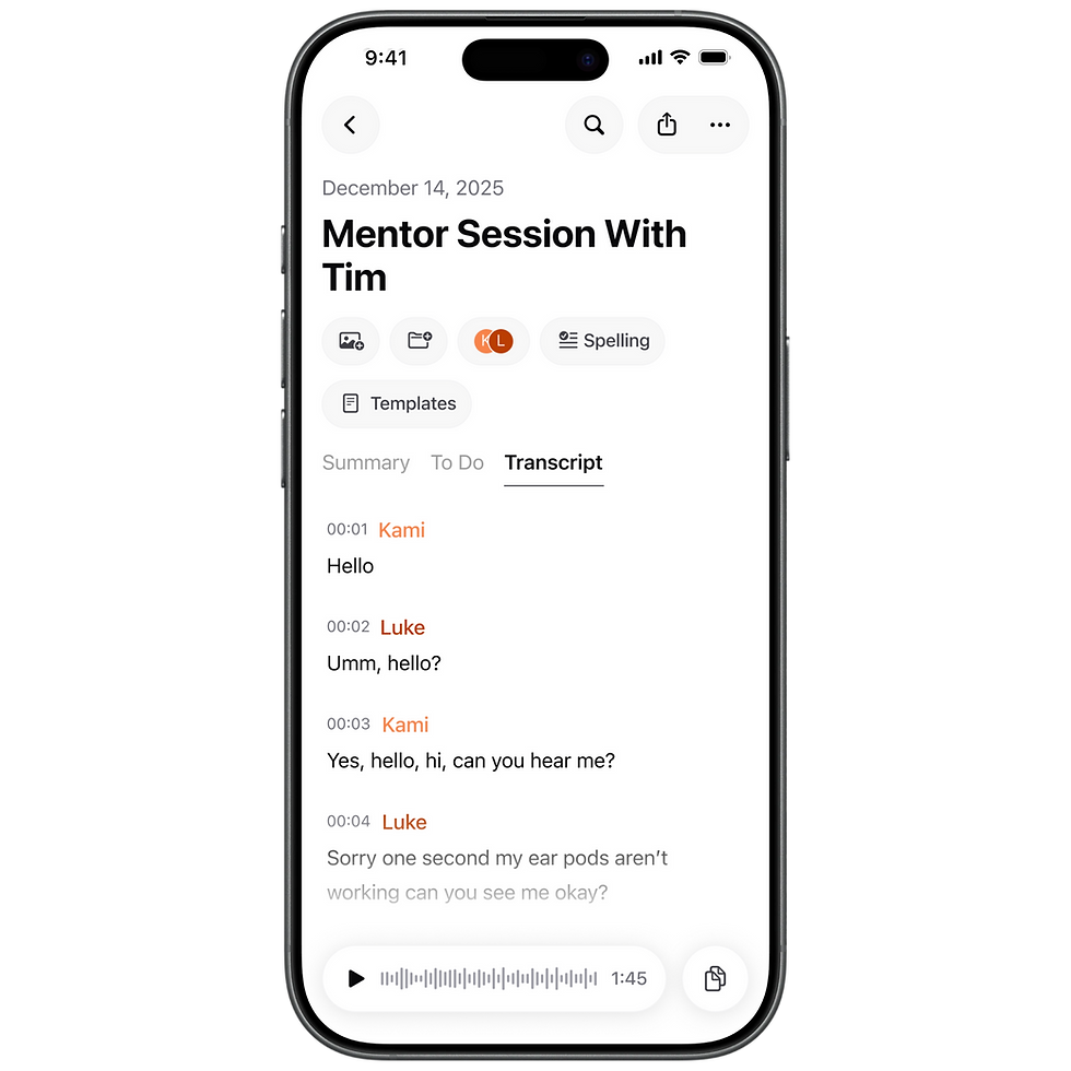
The first version was intentionally simple. Each speaker was assigned a colour-coded label in the transcript. Tap a label, type a name, and it updates everywhere in real time. A palette of 10 colours meant even large group meetings could be distinguished clearly. It was a small change that made the transcript dramatically more readable and useful.


//Phase Two - Designed
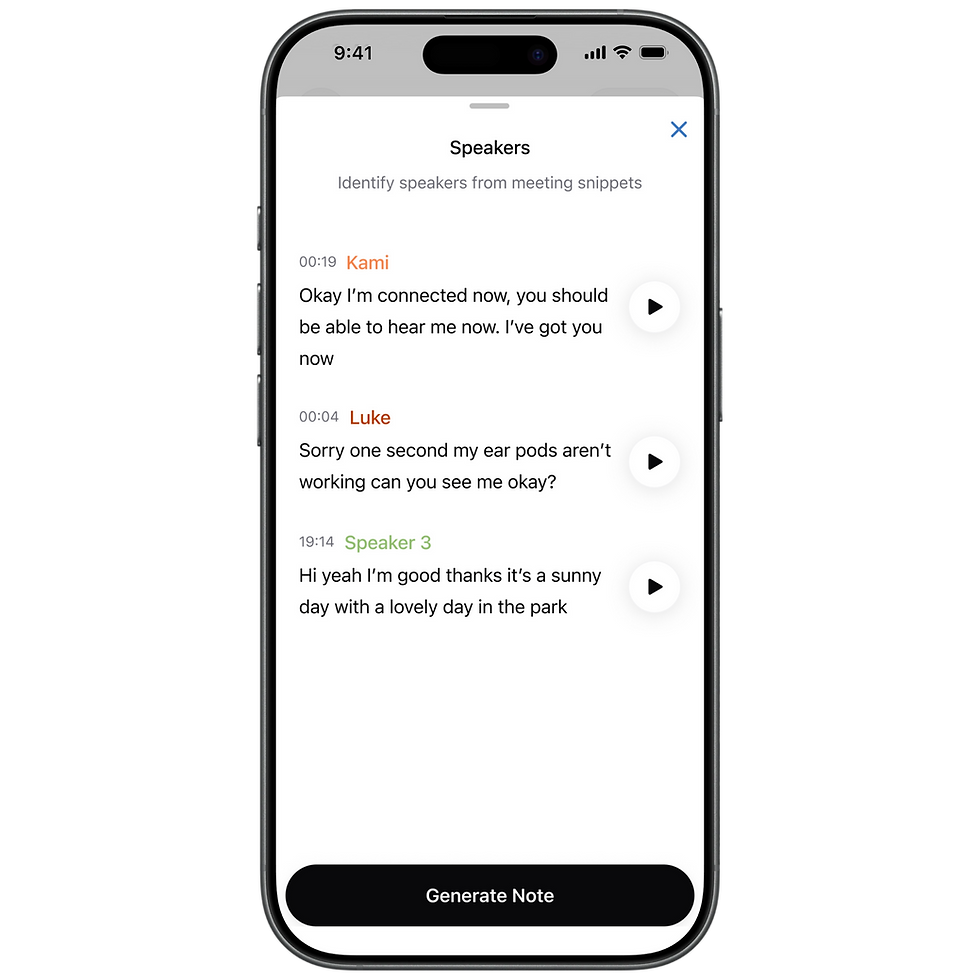
The second version was about elevation. Speakers moved from being a transcript-only feature to living on the main note page - visible as stacked avatar initials in the note header. A new identification flow let users confirm who was who by listening to short audio snippets of each speaker's voice, rather than guessing from context. The transcript labels became real names. The whole feature felt less like a settings task and more like a core part of the meeting record.
//Phase Three - Next Steps
Speakers was never just a UX improvement. It was the first step toward something larger - using the people in a meeting as a growth mechanic. Identified speakers mean saved contacts, calendar connections, shared notes, collaboration features. Each new layer unlocking a bigger growth opportunity, and pushing Cue into its next phase as a product.
Templates
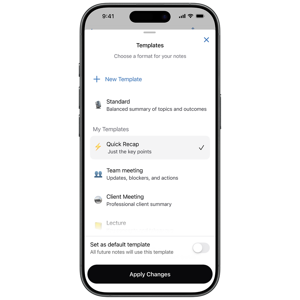
Every user needed their summary structured differently. A salesperson needed something ready to send to a client right after the meeting. A team lead needed clear agendas and next steps with ownership. A student needed bullet points they could study from.
We needed a system that let users change their default summary structure and create one that worked for them - so we built templates. It turned Cue from a one-size-fits-all recorder into something that could fit the way each person actually worked.